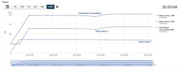
In some of my graphs the lines have the same colour and I can’t find out how to force the lines to have different colours. Obviously, all having the same colour makes it harder to visually understand the data.
Any suggestions please where I am going wrong ?
Hi David,
Could you open a ticket for this issue by emailing support@exosite.com? It’s easier for us to keep track of support requests there, and if we need to ask for any sensitive information we wouldn’t want it to be on the forum.
Thanks,
James
